
CueCase Rx
Human Centered Prescription Management
Over 60% of American Adults take prescription medications delivered via those iconic orange bottles.
CueCase is the redesign of both the medication bottle and the label to ensure safety and clarity for all of its users. Its color coded labels and caps help users identify the contents of their bottles at a glance, and the integrative cap provides a means to remember if you have taken your meds for the day.


Better, Safer Pill Bottles
One Flat Bottle at a Time
Making prescription medication safer and easier to use doesn't have top add friction to your routine. CueCase's flat bottle design dramatically improves legibility and helps keep your medicine cabinets organized. The slim shape is easy for on-the-go carry and travel, and the integrated child-safe twist cap includes a schedule tracking feature for safer more consistent dosage.
CueCase Team
Interdisciplinary Approach
Our team's diverse approaches to problem solving and array of skillsets coalesced to provide a clear and focused dedication to improving patients' experiences with prescription medication bottles.

Aidan
Product Design

Mary
Research

Quinn
Graphic Design

Gretchen
Research

Prescribed Peril
Understanding Existing Bottles
Prescription medication bottles are cumbersome and their cylindrical shape makes reading the already overcrowded and poorly printed labels difficult and, in some instances, dangerous.
Human-Centered medication bottles must encourage patient safety and prioritize the communication of the most important information.
Legible and Usable
Research Methodologies and Findings
Our team talked to patients across age and cultural demographics to learn about what is causing frustration with current medication bottles. Through a combination of in-person and virtual interviews as well as on-site learning with pharmacy technicians, we identified pain points, moments of delight, and opportunities to add value to the experience of taking, managing, and refilling prescription medication.
Senior Clarity
The Oldest Common Denominator


-
Font must be large and clear enough for poor eyesight.
-
Child Lock should be engaged with minimal wrist strain.
-
Should be able to identify certain information without reading text at all.
Roaming Routines
Schedule Based and On the Go


-
Bottle must be small enough to carry in a purse or a bag.
-
Looking for a simple way to track medication schedule across the day.
-
Refill information should be organized and easy to find.
Occupied Care
Busy Caretakers with Multiple Patients


-
Drug name and patient name should be highest priority information.
-
Instructions must be easy to locate.
-
Bottle should open with one hand.
Short Term Treatment
Unfamiliar with Best Practices


-
Clear identification that received medication is correct.
-
Bottle should be easy to travel with.
-
Instructions must be easy to understand and locate.
Storage and Visibility
Findings
Pill bottles are not always easy to identify on a shelf or a table.
Prescription identification is heavily dependent on the method of bottle storage. Whether on a shelf, on a table, or in a bag, CueCase makes a more efficient use of space than traditional medication bottles.


Child-Proof Orientation for Morning Dose
Inverted Orientation for Evening Dose
Schedule Tracking
Findings
It's hard to remember if you've taken your medication for the day—especially if there's multiple doses per day.
Several interviewees have resorted to flipping the bottle cap upside down to indicate that they have completed a dose. However, this compromises the child-proof function of the lid.


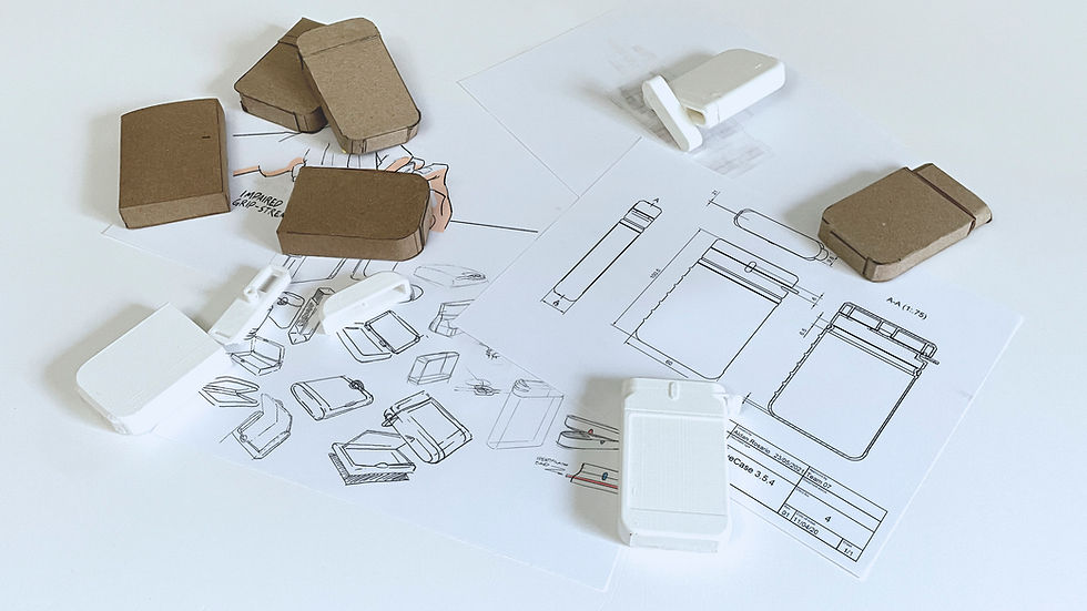


Comfort and Volume
CAD Exploration
We explored different corner treatments and label orientations to experiment with spatial claims for the chunks of information conveyed on the adhesive label. The final design also features optimized ergonomics and a comparable volume to traditional medication bottles.


Label design lead: Quinn Maynard
Label design support: Aidan Rosario


Communicative Labels
Implementing Legibility
-
Clear fonts with tall X-height.
-
Information groups separated by colors, tones, and placement on bottle.
-
Strong informational hierarchy.
-
Prominent Rx number.
-
Drug name and graphic on side.
Label design lead: Quinn Maynard
Label design support: Aidan Rosario


Identification
Instant Recognition
Like books on a shelf, the label's wraparound design provides the most essential information at a glance. Drug name and an illustrated pill graphic helps patients locate their medication bottles with ease.

Colorful Elastic Bands
Identify Patients.
Label Accent Color Indicates Medication Type.
Schedule Tracking
Configurable System
Integrated color-matching system on the cap allows patients and caretakers to structure a dosage reminder onto the bottle itself. Tactile distinction (raised or recessed bumps) help encourage use of this tracking system for patients with reduced visibility or color perception or in low light environments.


One Flat Bottle
Dieline Packaging Award
We are excited and honored to have CueCase featured by Dieline as a recipient of a Dieline Packaging Award. Our work received Third Place in the category of Student Packaging for "Health, Body, and Beauty".

